6 Popular Web Design Trends in 2023
In the ever-evolving landscape of the internet, web design is a dynamic field that continually adapts to changing technologies and user preferences. As we step into 2023, the digital landscape is poised for another wave of innovation and creativity. From aesthetics to functionality, web design trends are constantly evolving to meet the ever-changing needs and expectations of users. In this era of rapid technological advancement, websites are not just digital placeholders, they are dynamic, immersive experiences that engage visitors in ways never seen before. In this article, we'll explore six popular web design trends that are set to dominate the digital sphere in 2023, shaping the online landscape for businesses and users alike. From dark mode's sleek allure to the power of custom illustrations and the drive for greater accessibility, these trends are reshaping how we interact with and experience the web. Whether you're a designer, developer, or simply someone interested in the latest web aesthetics, these trends offer a glimpse into the exciting future of web design. Let's dive in and discover what 2023 has in store for web design.
Minimalist Web Design
As we navigate the vast digital universe, there's a rising inclination towards simplicity and clarity. Minimalist web design, a trend that has steadily gained traction, is poised to be a frontrunner in 2023. This design approach emphasizes the beauty in simplicity, eliminating any superfluous elements to highlight what truly matters. Simplicity isn't just about creating another website; it's about sculpting a digital sanctuary that offers users a seamless and serene experience.
Clean and Simple Color Palettes
Clean and simple color palettes are the unsung heroes, playing a central role in enhancing the user experience. As more brands realize the power of simplicity in design, it's no wonder that clean and straightforward color palettes are becoming the preferred choice for designers aiming to create timeless, impactful websites.
The beauty of clean colors lies in their ability to evoke specific emotions and moods. Lighter shades usher in a sense of calm and openness, while deeper hues add depth and gravity to a design. Simple palettes also make content pop, ensuring that the primary messages and calls to action aren't lost in the visual mix.
Such color choices don't just make websites look good, they ensure that the visuals align with the brand's voice, values, and overall narrative. When users land on a page with a clean and simple color scheme, they're not just witnessing a design choice, they're engaging with a brand philosophy that values clarity, sophistication, and user-centricity.
Simple Navigation Structure
Building on the minimalist approach and the emphasis on clear aesthetics, another trend taking center stage is the Simple Navigation Structure. The essence of a simple navigation structure is to streamline the user journey on a website. Imagine entering a room where everything is neatly organized and easy to find; that's precisely the goal here. At its core, a simple navigation structure organizes information clearly, often with fewer menu items, clean lines, and intuitive icons.
Menus are concise, avoiding overwhelming users with too many choices. Drop-down options, if used, are straightforward, making it easier for users to delve deeper without getting lost. Crucial buttons, like 'Contact' or 'Shop Now,' are prominently placed, reducing the steps a user needs to take to reach their goal. With the undeniable growth of mobile browsing, this simplicity must remain consistent across devices, reinforcing the need for responsive design.
As 2023 unfolds, the emphasis on simple navigation will continue to grow. This trend creates a space where visitors feel understood, where they can quickly find what they're after without unnecessary clicks or scrolls.
Dark Mode Web Design
Transitioning from the calm simplicity of minimalist designs, another trend capturing the imagination of designers and users alike is Dark Mode Web Design. As the digital landscape evolves, dark mode has emerged not just as a fashionable choice, but as a practical one, especially in 2023 where screen time is at an all-time high.

Reducing Eye Strain
One of the standout benefits of dark mode is its role in reducing eye strain. With more people working from home, attending virtual meetings, or binge-watching their favorite series late into the night, the impact of screen glare becomes noticeable. Dark mode, with its subdued color palette and dimmer luminance, offers a welcome respite. The reduced brightness minimizes flicker and blue light, making it more comfortable for eyes, especially in low-light environments. This not only promotes better eye health but can also help improve sleep patterns for those who have a habit of using devices before bedtime.
Modern and Stylish Appearance
Dipping into the aesthetic form of dark mode, several standout benefits become evident:
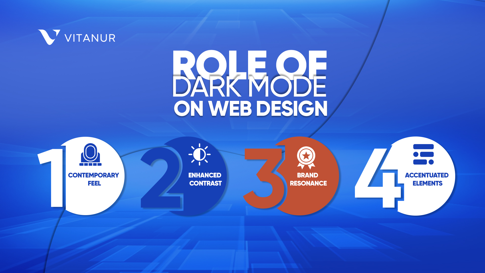
- Contemporary Feel: The darker themes naturally exude a modern, cutting-edge ambiance, transforming ordinary content into something more visually compelling.
- Enhanced Contrast: Colors appear richer and more vibrant against dark backgrounds, ensuring visuals and texts are more pronounced.
- Brand Resonance: For brands leaning into a high-tech or luxury space, a dark design often encapsulates and conveys their ethos perfectly.
- Accentuated Elements: Dark mode ensures critical design components like images, videos, and CTAs aren't lost in the background. Instead, they stand out, commanding more attention and encouraging interaction.
Indeed, the changes towards dark mode isn't just a nod to the latest design trend. It's a thoughtful embrace of a style that accentuates content, resonates with brand identities, and, most importantly, captivates the audience's eye.
3D Graphics and Illustrations
Continuing our journey through the most impactful web design trends for 2023, 3D Graphics and Illustrations emerge as a groundbreaking trend. As technology continues to evolve and browsers become more powerful, the realm of 3D graphics in web design is expanding, offering visitors an enriched and immersive experience.

Immersive Use of 3D Graphics
Today's web designs are not just about flat visuals and static images; they're about creating depth and dynamism. The incorporation of 3D graphics is transforming the way users perceive and interact with online spaces. When artfully integrated into a website:
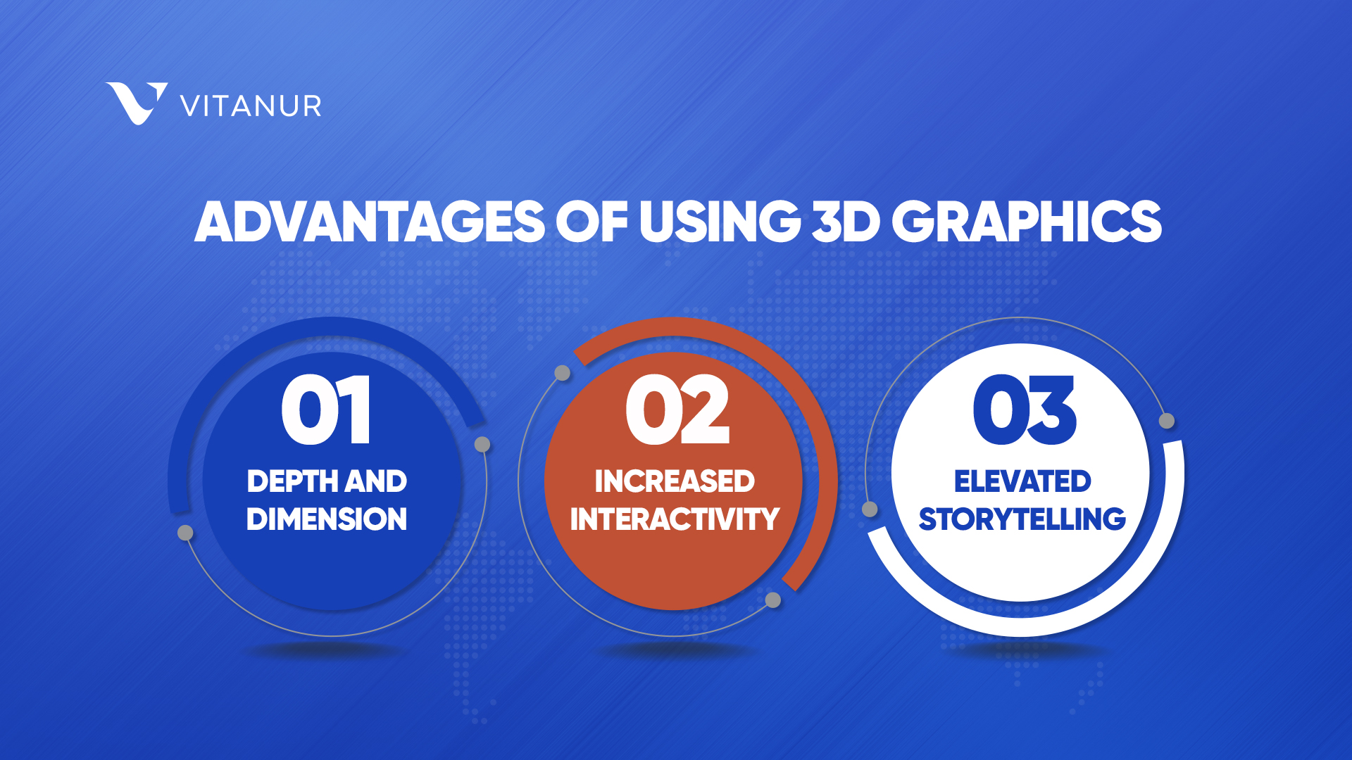
- Depth and Dimension: By adding layers and perspective, 3D elements immerse users in a multi-faceted visual journey, keeping them engrossed and intrigued.
- Increased Interactivity: With evolving coding capabilities, 3D graphics can become tactile spaces, letting users manipulate, explore, and immerse themselves in the visual elements.
- Elevated Storytelling: Through 3D animations and graphics, brands can weave their narratives in more engaging and memorable ways.
By leveraging 3D elements, web designers offer more than just static information—they provide dynamic experiences. As we progress through 2023, this fusion of design and technology will shape online spaces that resonate and captivate more than ever before.
Nostalgia and text-based designs
Moving from the immersive depth of 3D graphics, we now see a pivot to a different kind of depth, one that delves into the archives of design history. The early 2000s, a time remembered for its bold digital choices, distinctive fonts, and striking patterns, are making a fascinating comeback in the world of web design. This resurrection is none other than the Y2K aesthetic, which melds nostalgia with contemporary flair.
Y2K Aesthetic Web Design
The dawn of the 21st century was a period of exploration and excitement in digital design, marked by vibrant colors and distinctive patterns. As this Y2K style finds its way back into our screens, it's not merely about duplicating past trends. Designers are infusing it with modern sensibilities, creating a blend that feels both nostalgic and fresh.
This aesthetic does more than just appeal to the eyes, it tugs at the heartstrings, reminding us of simpler times. But it doesn't get trapped in yesteryears. The fusion of past and present elements ensures that the design remains relevant for today's audience. The result is an immersive experience that spans time, offering brands a unique narrative opportunity that weaves together memories from the past with the pulse of today's trends.
Typographic layouts
Building on the ever-evolving design landscape, typographic layouts have come to the forefront in 2023 as a refreshing and captivating trend. As we navigate through different design innovations, the profound influence of typography is clear, emphasizing its role in shaping how content is both seen and absorbed.
Typographic layouts spotlight not just the font selections but also the manner in which text becomes the primary design element, orchestrating a compelling visual narrative that underscores crucial messages.
Typography as a Focal Point
Effectively employed typography transitions from mere readable text to the main visual attraction. Bold, oversized fonts demand immediate attention, embodying the spirit of a brand, whereas delicate and refined typography exudes sophistication. With text emerging as the protagonist, designers are demonstrating the profound impact of well-positioned typography, crafting immersive web experiences that resonate. This reinforces the idea that, at times, innovatively showcased text can indeed create a powerful impact.
Split Screen Web Design
While typography serves as a powerful tool in design, another compelling trend taking the stage in 2023 is split screen web design. Breaking away from traditional layouts, this innovative approach divides the screen into distinct sections, offering multiple visual elements simultaneously.
Split screen designs are reshaping the way users interact with websites, creating a dual-focus approach that captures attention instantly. This layout is incredibly versatile, allowing designers to present dual narratives or showcase different products side by side. Imagine a fashion brand displaying its men's collection on one side and the women's on the other, or a tech company contrasting the old with the new. By using split screens, brands cater to diverse audiences in a single view, enhancing user engagement and providing a dynamic browsing experience. In an age where differentiation is key, split screen web design stands out as a trend that fuses both form and function.
Benefits of Trend Web Designs
As we've journeyed through the diverse landscape of web design trends set to dominate 2023, it becomes evident that these trends are not just fleeting aesthetic choices. They have tangible benefits that can elevate the online presence of any brand.
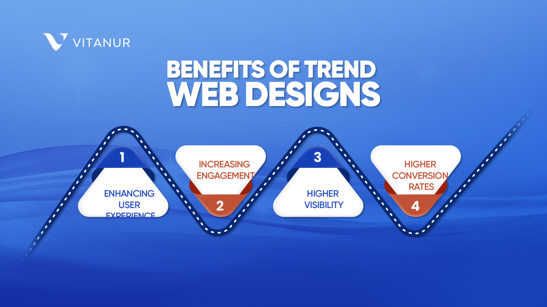
Embracing modern web design trends goes beyond creating visually appealing sites. It's about enhancing user experience, increasing engagement, and ensuring that your website remains relevant in an ever-evolving digital world. Trendy designs can boost your site's visibility, improve its search engine ranking, and ultimately lead to higher conversion rates. From immersive 3D graphics to the nostalgic vibes of Y2K aesthetics, these trends cater to the diverse tastes and preferences of the modern audience, ensuring that there's something for everyone.

To truly harness the power of these design trends, it's essential to have the right partner by your side. Vitanur's web design service brings expertise and innovation to the table. Our team is well-versed in the evolving digital landscape, ensuring your website is not just trendy but effective. As you prepare to embrace 2023's digital horizon, trust Vitanur to craft a website that stands out and delivers


Write a comment
Your email address will not be published. Required fields are marked *